Color Psychology in Game Design: How Palettes Shape Emotion
Updated August 3, 2026
A game’s palette starts working on you the moment the first frame renders. Research on color and emotion points to two dials doing most of the work: saturation and brightness. Bright, saturated palettes push arousal and pleasure up; dark, desaturated ones pull both down toward dread.
How does a color palette change how a game feels?
Every palette sets three dials: hue (which color), saturation (how pure the color is), and brightness (how light it is). Folk color psychology talks almost entirely about hue: blue is sad, red is angry, green is calm. Controlled experiments keep finding something less romantic and more useful: saturation and brightness carry most of the measurable emotional effect, and hue trails behind. A dark, muddy red and a bright, saturated red share a hue and feel nothing alike.
For a game this matters because the palette touches every pixel of every frame for the entire runtime. It works like a standing instruction to your nervous system about how alert to be. Before you learn a single mechanic, the screen has already suggested whether this world is safe to poke around in or likely to kill you.
What does the research actually say about color and emotion?
Two studies are worth naming. Patricia Valdez and Albert Mehrabian (Journal of Experimental Psychology: General, 1994) had participants rate color samples on pleasure, arousal, and dominance. Brightness was the strongest predictor of pleasure, saturation was the strongest predictor of arousal, and hue’s effects were smaller and less consistent.
Lisa Wilms and Daniel Oberfeld (Psychological Research, 2018) tightened the method: 62 participants viewed colors that varied independently in hue, saturation, and brightness while skin conductance and heart rate were recorded. Saturated and bright colors produced higher arousal, arousal rose from blue and green toward red, and valence ratings peaked for bright, saturated colors.
Both are lab studies of isolated color fields, not games. So treat the game readings below as craft analysis informed by the mechanism rather than measured results.
With that stated plainly, here are the seven palettes this post reads, in one block. Every row is unpacked in the sections that follow.
| Game | Studio, year | Hue direction | Saturation | Brightness | Emotional effect |
|---|---|---|---|---|---|
| Limbo | Playdead, 2010 | None, literally grayscale | Zero | Kept near the floor | Dread. Nothing is supposed to feel comfortable |
| Inside | Playdead, 2016 | Desaturated teals and grays, one red shirt | Low, with a single saturated object | Low | A drained world, and your eye finds the boy instantly |
| Firewatch | Campo Santo, 2016 | Warm oranges, golds, dusty pinks | Moderate | High | Pleasant without being alarming, so you want to explore |
| Stardew Valley | ConcernedApe, 2016 | Warm greens and soft tones | Mid | High | Pleasure up, arousal comfortable rather than urgent |
| Animal Crossing: New Horizons | Nintendo, 2020 | Warm greens and soft tones | Mid | High | The same calm zone as Stardew Valley |
| Hades | Supergiant Games, 2020 | Shifts by region: lava red, green and gold, magenta | Near maximum, almost never drops | Not read in this post | Combat level alertness held for a whole run, menus included |
| Gris | Nomada Studio, 2018 | Grayscale, then red, green, blue, yellow in turn | Starts at zero, returns one chapter at a time | Not read in this post | The palette is the emotional arc itself |
Hue, saturation and brightness readings in this table are our own craft analysis of how each game looks, not measurements taken from the games or from the studies.
Why do dark, desaturated games feel so tense?
Playdead built two entire games on the low end of both dials. Limbo (2010) is literally grayscale: black silhouettes, fog, film grain, brightness kept near the floor. On Valdez and Mehrabian’s numbers, low brightness suppresses pleasure, which is exactly the point. Nothing in Limbo is supposed to feel comfortable, and the silhouettes hide just enough detail that your imagination fills in something worse.
Inside (2016) makes the same move in color. Its industrial world sits in desaturated teals and grays, and the boy’s red shirt is close to the only saturated object on screen. That single decision does two jobs at once: your eye finds the player character instantly in any composition, and the world around him reads as drained, a place where color has been used up.
Why do warm palettes read as safe?
Firewatch (Campo Santo, 2016) runs the opposite play. Its Wyoming wilderness, built around artist Olly Moss’s poster-style key art, layers warm oranges, golds, and dusty pinks even at midday. Brightness is high, saturation is moderate, and per the research that combination lands as pleasant without being alarming. You feel like exploring, which is the whole game.
Cozy games park themselves in the same zone on purpose. Stardew Valley (2016) and Animal Crossing: New Horizons (2020) lean on warm greens and soft, bright tones: high brightness for pleasure, mid saturation so arousal stays comfortable rather than urgent. We have written before about what makes a game cozy and why cozy games relax the body as well as the mind; palette is one of the few levers in that mix that reaches you within the first second of play.
What do highly saturated palettes do to the player?
If saturation is the arousal dial, Hades (Supergiant Games, 2020) pins it to maximum. Lava reds in Asphodel, greens and golds in Elysium, magenta accents throughout the House: the hue shifts from region to region, but the saturation almost never drops. That matches the job description. A fast roguelike wants you at combat-level alertness for a whole run, and the palette holds you there even between fights. Supergiant’s character portraits are just as saturated, so the energy never dips in menus either.
Can a palette carry the story by itself?
Gris (Nomada Studio, 2018) is the cleanest demonstration that a palette can be the narrative arc, not just its backdrop. The game opens in near-total grayscale and returns color one chapter at a time: red, then green, then blue, then yellow, each new hue arriving with a new region and a new ability as the silent protagonist works through loss. You can track her emotional state across the whole game purely by watching the saturation of the world recover. No dialogue, no text: hue as plot structure.
How did we choose the palette for Grandma Left Me a Building?
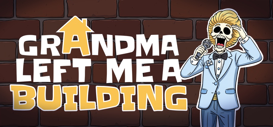
Our own game, Grandma Left Me a Building, is an unreleased cozy apartment management sim with hand-drawn cartoon art, and we picked its warm palette deliberately. Management sims carry built-in stress: rent ledgers, repair queues, tenants with problems. If the screen also ran cold and desaturated, the whole experience would drift toward anxiety. So we went the other way: warm tones, high brightness, soft hand-drawn linework, aiming at the same pleasant-but-calm region of the color research that Stardew Valley and Animal Crossing occupy. The building should feel like a place you want to fix. We broke down the rest of that thinking in how we designed Grandma Left Me a Building, and you can see the art style on the press page.
Frequently asked questions
Does color really change how a player feels?
Yes, though mostly through two dials rather than the color wheel. Lab work on isolated color patches ties brightness to pleasure and saturation to arousal, so how light and how pure a palette is matters more than whether it leans blue or red.
Which matters more for mood, hue or saturation?
Saturation, if you have to pick one. The 1994 study found hue’s effects smaller and less consistent than either of the other dials, while saturation tracked arousal and brightness tracked pleasure. Choose those two first, then pick a hue that suits the world.
Does a dark palette make a game feel tense?
Yes, when saturation drops with it. Limbo keeps brightness near the floor in pure grayscale and Inside drains its industrial world to teals and grays, so the screen withholds pleasure before you learn a single mechanic. One saturated object in that gray world becomes the eye’s anchor.
Can these findings be applied straight to a game?
Not directly. Both experiments showed people flat color fields in a lab, not moving scenes with characters and sound, so the readings here are craft analysis guided by the mechanism. Use them as a starting hypothesis and test the result in your own build.
Key takeaways
- Saturation and brightness predict emotional response more strongly than hue (Valdez and Mehrabian, 1994; Wilms and Oberfeld, 2018).
- Brightness tracks pleasure, saturation tracks arousal, and red sits higher on arousal than blue or green.
- Dark plus desaturated (Limbo, Inside) reads as threat and grief; one saturated object in a gray world becomes an instant focal point.
- Warm, bright, mid-saturation palettes (Firewatch, Stardew Valley, Animal Crossing) invite exploration and calm.
- Uniformly high saturation (Hades) keeps the player at high alertness, even in menus.
- A palette can carry narrative structure on its own (Gris).
If a warm, hand-drawn apartment building full of tenants sounds like your kind of place, you can wishlist Grandma Left Me a Building on Steam.
Sources
- Valdez, P., & Mehrabian, A. (1994). Effects of color on emotions. Journal of Experimental Psychology: General, 123(4), 394-409. doi.org/10.1037/0096-3445.123.4.394
- Wilms, L., & Oberfeld, D. (2018). Color and emotion: effects of hue, saturation, and brightness. Psychological Research, 82(5), 896-914. doi.org/10.1007/s00426-017-0880-8